Caitlin Donahue
Work
About
Resume
Work
About
Resume
Caitlin Donahue
Scroll
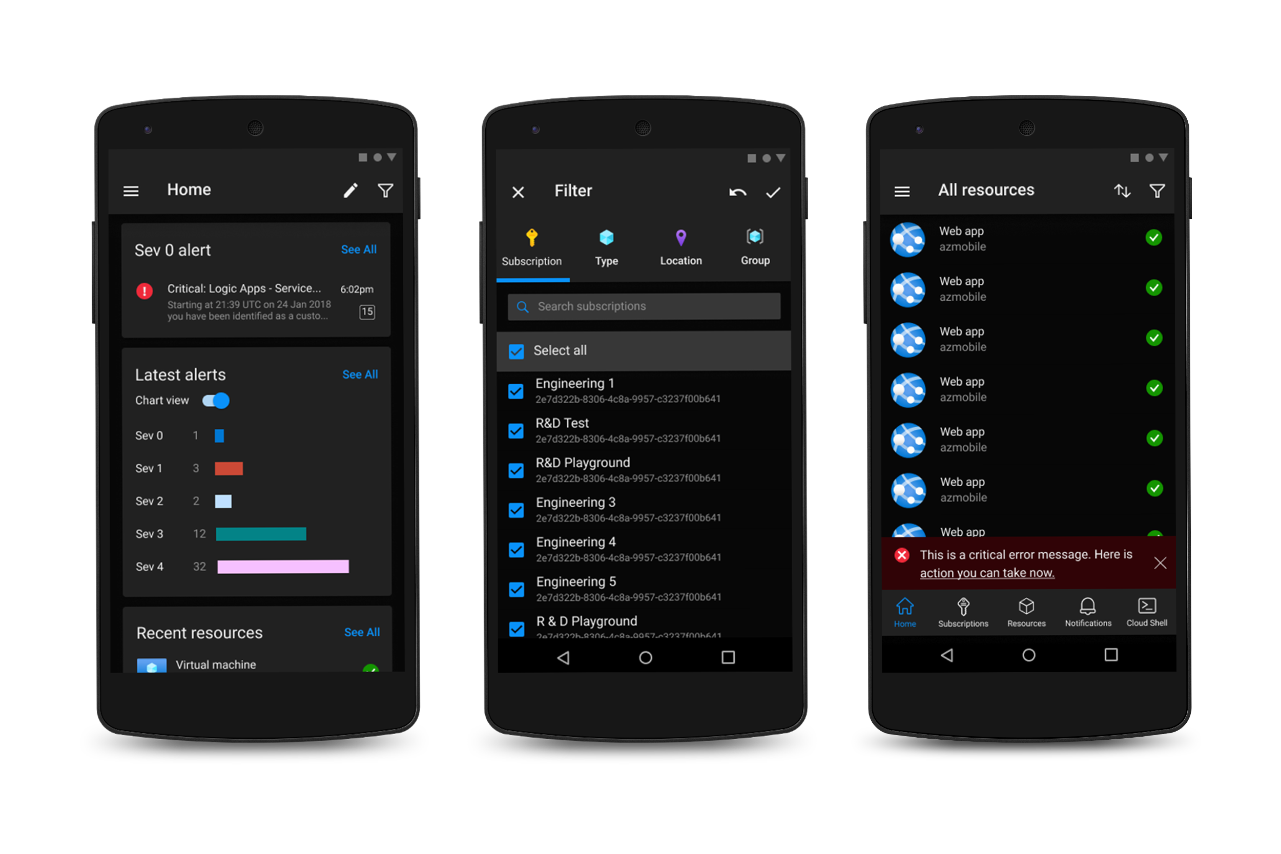
Dark Theme
An experiment with the flip
side of color